In today’s globalized world, projects often cater to an international audience. Whether you’re designing a website, creating a mobile app, or working on a marketing campaign, flag icons can be a crucial element in communicating effectively with users from different countries. Flag icons are more than just decorative elements; they can convey critical information about language options, geographic relevance, and cultural representation. However, choosing the right flag icons for your projects requires careful consideration of several factors. This blog post will guide you through the process of selecting the most appropriate flag icons to enhance the user experience and achieve your project’s goals.
Understanding the Importance of Flag Icons
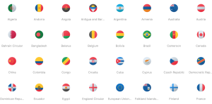
Flag icons serve multiple purposes in various types of projects. They are commonly used to:
- Indicate Language Options: When a website or application supports multiple languages, flag icons can help users quickly identify and switch to their preferred language.
- Represent Geographic Locations: Flag icons can signify the geographic origin of content, products, or services. For instance, e-commerce sites may use flags to indicate the shipping country.
- Cultural Representation: Flags can be used to celebrate cultural diversity and inclusivity, especially during international events or campaigns.
- User Interface Elements: Flags often appear in user interfaces as part of dropdown menus, buttons, or navigation elements.
Given their varied uses, it’s essential to choose flag icons that are accurate, high-quality, and contextually appropriate.
Factors to Consider When Choosing Flag Icons
When selecting flag icons for your projects, consider the following factors:
1. Accuracy and Authenticity
Ensure that the flag icons you choose are accurate representations of the official national flags. This includes the correct colors, proportions, and design elements. Inaccurate flags can lead to confusion and may offend users from the represented countries.
2. Quality and Resolution
High-quality flag icons are crucial for a professional appearance. Choose icons that are available in multiple resolutions and formats (e.g., SVG, PNG) to ensure they look sharp on various devices and screen sizes. Scalable Vector Graphics (SVG) format is particularly useful because it maintains quality at any size.
3. Contextual Relevance
Consider the context in which the flag icons will be used. For instance, using the Union Jack to represent the English language can be controversial since English is spoken in many countries. In such cases, a more neutral symbol or a combination of flags may be more appropriate.
4. Accessibility
Ensure that the flag icons are accessible to all users, including those with visual impairments. This may involve providing alternative text descriptions for screen readers and ensuring sufficient color contrast.
5. Consistency
Maintain consistency in the style and design of flag icons across your project. Inconsistent icon styles can make your project look unprofessional and disjointed. Many icon libraries offer sets of flag icons that are consistent in style.
6. Licensing and Usage Rights
Check the licensing and usage rights of the flag icons you choose. Some icon sets are free to use, while others may require attribution or payment. Ensure you comply with the licensing terms to avoid legal issues.
Popular Sources for Flag Icons
There are several reliable sources for high-quality flag icons. Here are some popular options:
1. Icon Libraries
- Icons8: Icons8 offers a comprehensive set of icons, including flag icons. These icons are vector-based and can be customized in terms of size, color, and style.
- Flaticon: Flaticon provides a vast collection of flag icons in various styles and formats. It offers both free and premium options.
- Noun Project: The Noun Project hosts a diverse collection of icons created by designers from around the world, including flag icons. It offers subscription plans for unlimited access.
2. Design Tools
- Canva: Canva is a popular design tool that includes a wide range of flag icons in its library. These icons can be easily customized and incorporated into your designs.
- Figma: Figma offers various plugins and resources for flag icons. You can find community-created libraries that provide high-quality flag icons for your projects.
3. Dedicated Flag Icon Sets
- GoSquared Flag Icons: This is a dedicated set of flag icons designed for web use. The icons are available in SVG format and are free to use.
- Twemoji: Created by Twitter, Twemoji includes a set of flag emojis that are open-source and free to use. These icons are great for projects that aim for a more playful or casual tone.
Best Practices for Using Flag Icons
To maximize the effectiveness of flag icons in your projects, follow these best practices:
1. Use Flags Appropriately
Avoid using flag icons to represent languages directly. Instead, use flags to indicate countries and provide a language switcher with text labels. This helps avoid confusion and ensures clarity.
2. Provide Clear Labels
Accompany flag icons with clear text labels. This is especially important for accessibility and for users who may not recognize certain flags.
3. Optimize for Performance
Use optimized versions of flag icons to ensure they load quickly. Compress images and use SVGs where possible to reduce file sizes without compromising quality.
4. Test Across Devices
Ensure that flag icons look good and function correctly across different devices and screen sizes. Test your project on various platforms to identify and fix any issues.
5. Respect Cultural Sensitivities
Be mindful of cultural sensitivities and political contexts when using flag icons. Some flags have significant historical or political connotations that may affect how they are perceived by users.
Examples of Effective Flag Icon Usage
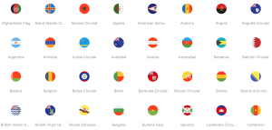
1. Language Switchers
Many multilingual websites use flag icons in language switchers to help users quickly identify and select their preferred language. For example, a language switcher might include the flags of the United States, Spain, and France to represent English, Spanish, and French languages, respectively.
2. Geographic Indicators
E-commerce platforms often use flag icons to indicate the shipping country. For instance, a product page might display the flag of Germany to show that the item ships from Germany.
3. Cultural Celebrations
During international events such as the Olympics or World Cup, websites and apps often use flag icons to celebrate the participating countries. This adds a festive and inclusive touch to the user interface.
4. User Profiles
Social media platforms and forums may allow users to display their country’s flag on their profile. This helps foster a sense of community and global connectivity.
Conclusion
Flag icons are a powerful tool in your design arsenal, capable of enhancing user experience, indicating geographic relevance, and celebrating cultural diversity. By considering factors such as accuracy, quality, contextual relevance, accessibility, consistency, and licensing, you can choose the right flag icons for your projects. Leveraging popular sources and following best practices will ensure that your use of flag icons is effective, respectful, and visually appealing.
Remember, the goal is to create a seamless and inclusive experience for all users. Thoughtfully chosen flag icons can help you achieve this goal and make your project stand out in the global landscape. Whether you’re designing a multilingual website, an international marketing campaign, or a culturally diverse app, the right flag icons will enhance your project’s impact and user engagement.

