In the realm of user interface (UI) design, icons play a crucial role in creating intuitive and efficient user experiences. Settings icons, in particular, are fundamental to applications, allowing users to customize, configure, and personalize their environment. However, designing these icons with accessibility in mind is often overlooked, leading to barriers for users with disabilities. This blog post aims to provide UI designers with comprehensive insights into accessibility considerations for settings icons to create more inclusive digital experiences.
Why Accessibility Matters for Settings Icons
Accessibility in UI design ensures that users with disabilities can effectively interact with digital interfaces. For settings icon, this means designing for people with visual impairments, motor disabilities, cognitive limitations, and other disabilities. The following reasons underscore the importance of accessibility in this context.
- Inclusivity. An accessible design is an inclusive design. Ensuring everyone, regardless of ability, can navigate and understand your settings icons creates a more equitable experience.
- Compliance. Many regions have legal requirements for digital accessibility, like the Americans with Disabilities Act (ADA) in the U.S. and the Web Content Accessibility Guidelines (WCAG) globally. Failure to comply can lead to legal repercussions.
- Enhanced User Experience. Accessibility benefits all users, not just those with disabilities. It fosters better usability, clarity, and user satisfaction.
Key Accessibility Considerations for Settings Icons
To design accessible settings icons, UI designers should consider several factors, from color contrast to iconography. Here’s a breakdown of the essential considerations.
1. Color Contrast
Color contrast is a critical factor in accessibility. Icons that lack sufficient contrast can be challenging to see for users with low vision or color blindness. To ensure your settings icons meet accessibility standards, consider the following.
- WCAG Guidelines. WCAG 2.1 recommends a minimum contrast ratio of 3:1 for UI components and graphical objects, with a higher ratio of 4.5:1 preferred for text-based elements.
- Use of Color. Avoid relying solely on color to convey information. If a settings icon changes color to indicate a state (e.g., active/inactive), include additional visual cues like shape changes or text labels.
2. Iconography and Symbolism
Icons should be easily recognizable and understood by a diverse audience. Ambiguity or cultural bias in iconography can create confusion. Here are some best practices.
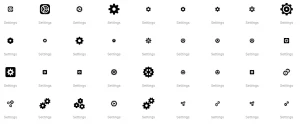
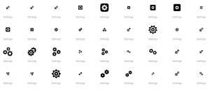
- Universally Recognized Icons. Use widely accepted symbols for settings, such as a gear or wrench. This familiarity helps users understand the icon’s function.
- Consistency. Maintain consistent iconography throughout your design. If a gear represents settings in one area, it should represent the same concept elsewhere.
- Clarity. Avoid overly intricate or complex icons. Simple, clear symbols are easier to understand.
3. Size and Spacing
The size and spacing of icons can impact accessibility, particularly for users with motor disabilities. Consider these guidelines.
- Touch Targets. Ensure touch targets are large enough to accommodate users with limited motor control. A minimum size of 44×44 pixels is recommended for touch interactions.
- Spacing. Provide sufficient spacing between icons to reduce the risk of accidental taps or clicks.
4. Screen Readers and Text Descriptions
Screen readers are essential for users with visual impairments. Providing accessible text descriptions for settings icons is crucial for compatibility with screen readers. Here’s what you should consider.
- Alternative Text. Use descriptive alt text or aria-labels for settings icons to ensure screen readers convey the correct information. The text should be concise yet descriptive enough to communicate the icon’s purpose.
- Semantic HTML. Use appropriate semantic HTML elements to ensure screen readers understand the context and hierarchy of your UI.
5. Interaction and Feedback
Accessible settings icons should provide clear feedback when interacted with. This is important for users with motor disabilities and cognitive limitations. Here’s what to focus on.
- Feedback Mechanisms. Provide clear visual and auditory feedback when an icon is clicked or tapped. This could include color changes, animations, or audible cues.
- Keyboard Accessibility. Ensure settings icons are accessible via keyboard navigation. This includes tab focus, appropriate keyboard shortcuts, and visible focus indicators.
- Error Prevention and Handling. Design settings interactions to minimize errors, and provide clear instructions for error correction if needed.
6. Testing and User Feedback
Finally, testing and user feedback are essential for ensuring accessibility. Engage users with disabilities in your testing process to identify potential issues and gather insights for improvement. Here are some best practices.
- Accessibility Testing Tools. Use tools like Axe, Wave, or Lighthouse to identify accessibility issues in your design.
- User Testing. Conduct usability tests with a diverse group of users, including those with disabilities, to gather feedback on your settings icons’ accessibility.
- Iterate and Improve. Use feedback to iterate on your design and improve accessibility. Remember, accessibility is an ongoing process, not a one-time fix.
Conclusion
Designing accessible settings icons is a critical component of creating inclusive digital experiences. By considering factors like color contrast, iconography, size, screen reader compatibility, interaction feedback, and user testing, UI designers can create settings icons that are accessible to all users. This not only improves usability for people with disabilities but also enhances the overall user experience for everyone.
As UI designers, let’s commit to making accessibility a central part of our design process. By doing so, we can ensure that settings icons—and the broader digital environments they inhabit—are accessible, inclusive, and user-friendly for all.